
Make Your Brand Look Pro on a Budget: 4 Tips
When you're still early in your business, it can be hard to do all.the.things. Websites, photos, logos - the list goes on. Now I've been lucky, being a web developer and graphic designer, I've been able to do all those things for myself, but I know most of you are not in the same position! So here are 4 ways you can look like a professional brand, without having to drop $$$$ on a branding specialist.
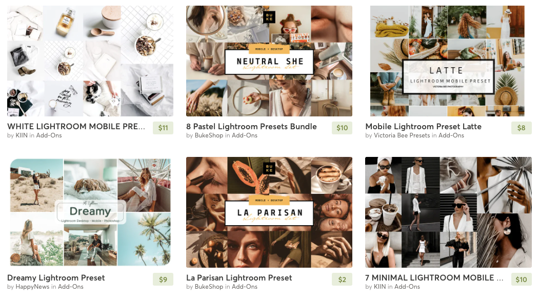
Photo filters can help you create consistency in your images.
1. Photo Consistency
Just because you don't have the funds for a professional photoshoot, it doesn't mean you can't at least try and make the photos you do have look good. An easy way to do that is with filters. You may have photos taken at various times and at different places, so using the same filter on all the photos can help bring about consistency. Check out Etsy or Creative Market and search "Lightroom Mobile Filters". You can then use the Adobe Lightroom mobile app (it's free but you do have to make an account) on your phone to apply the filters.
Don't want to use your phone or buy filters? You can also apply a simple color overlay or effect to your photos. Try using Canva to apply a colored shape that covers your whole photo. Then use the "Transparency" option to adjust the opacity. Choose a color that matches your brand!
Or choose one of their fun effects or filters and see how it turns out. The most important thing is to be constant. If you are doing colors - stick with doing colors, or filters - stick with the same filter.
2. Use the Same Fonts
As a recovering Graphic Designer, my eye tends to catch even the smallest things. One mistake I see many entrepreneurs make, especially when first starting out, is not using the same fonts. Usually if they are using templates or premade graphics.
You want to choose 2-3 fonts and stick with them across all your content - website, images, PDFs, etc. Rule of thumb (though this isn't too strict) is to mix types. For example, you may want to use a Serif font for your Titles/Headings, and a Sans Serif font for your text. Avoid using Script/Handwriting fonts for body text - it's too hard to read, use them for headings or decoration/quotes.
And for the love of all that is holy - never use Comic Sans or Papyrus!
If you aren't sure which fonts to use, there are many sites that do font pairings, such as Typ.io. Google Fonts also does font pairings with their fonts. You'll notice as you select fonts, below they'll list suggestions.
If you want to keep things simple - Google Fonts is a good way to go because many services use Google Fonts.
Using the same fonts across all areas of your brand creates a recognition - someone will know it's your "stuff" when they see it. Think about some of your favorite, most recognized brands - they all have that consistancy don't they?

3. Use the Same Colors
Just like with fonts, you want to use the same colors across your brand. Choosing 3-4 is a good number. Once you have the colors, make sure you save the Hex Codes so that you can ensure you always have the exact color. Choosing lighter and darker colors creates a good mix. You can also add in black & white too if you want!
Want some inspiration or to better understand color pairings? Check out this guide on Canva. Creating color pairings is a science, and you can do it wrong. Think warm vs. cool, bright vs. muted, dark vs. light - hot pink does not look good with burnt orange!
4. Graphic/Image/Style Consistency
If you are using something like Canva to create graphics and images for your site or social, it's important to stay continuous with the style and graphics you are using.
If your brand is more fun and bold - use more fun and bold templates and designs. Once you find a few templates you like - stick with them. This again helps make your brand recognizable. You can still create variety by switching out colors from your brand colors, for example one time the background is dark and the graphics are light. Or maybe you switch around the elements and how they are laid out on the design. It switches things up so it isn't the same thing over and over - but still has your brand "look".
Hopefully those tips help you out and give you the chance to create a beautiful brand presence!

